
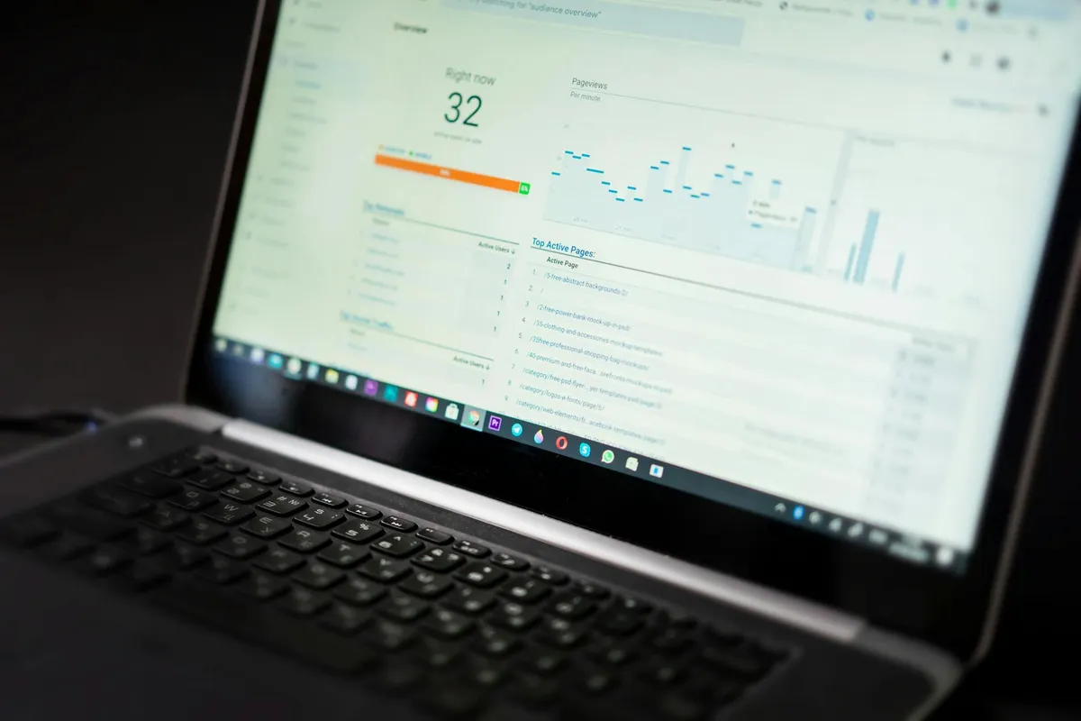
Performance optimization work that doesn't begin with diagnosis frequently optimizes the wrong thing. Teams compress images on a page where the bottleneck is server response time. They add caching layers to a slow page where the issue is third-party scripts. The optimization work is real; the impact is invisible because the diagnosis was wrong. This article presents a diagnostic methodology that reliably identifies the actual bottleneck before optimization work begins.
The diagnostic levels
Web performance can be analyzed at four levels. Each level has its own metrics, tools, and intervention space. Diagnosis works best when you isolate which level the bottleneck lives at before deciding what to fix.
Level 1: Network and delivery
Time-to-first-byte (TTFB), time-to-first-byte-at-edge for cached content, total payload size, request count. These measure how fast bytes arrive at the browser.
Tools: Chrome DevTools Network panel, WebPageTest, Cloudflare Analytics for cache hit rates.
Common diagnosis signals: high TTFB (>500ms) suggests origin server slowness; many small requests suggest poor bundling or excessive third-party scripts; large payloads suggest unoptimized assets.
Level 2: Rendering and parse
First Contentful Paint (FCP), Largest Contentful Paint (LCP), Cumulative Layout Shift (CLS). These measure how fast and stably the page becomes visually usable.
Tools: Lighthouse, PageSpeed Insights, Chrome User Experience Report (CrUX) for field data.
Common diagnosis signals: LCP > 2.5s suggests slow main asset rendering; high CLS suggests layout instability from late-loading elements; FCP > 1.8s suggests render-blocking resources.
Level 3: Interactivity and main thread
Interaction to Next Paint (INP), Total Blocking Time (TBT), Long Tasks. These measure how responsive the page feels to user input.
Tools: Chrome DevTools Performance panel, INP measurement in real user monitoring.
Common diagnosis signals: INP > 200ms suggests main-thread blocking; many long tasks (>50ms) suggest poorly-chunked JavaScript; high TBT suggests heavy initial JS work.
Level 4: Application logic and data
API response times, database query performance, render efficiency, state-management overhead. These measure where the application itself is spending time.
Tools: APM (DataDog, New Relic), database query analysis, profiling.
Common diagnosis signals: slow API endpoints, N+1 query patterns, unnecessary re-renders, memory pressure causing GC pauses.
The diagnostic sequence
Effective diagnosis works through the levels in order, not at random. A typical sequence:
- Measure user-experience metrics first. LCP, INP, CLS from real user data (CrUX) tell you what the actual problem feels like to users. Synthetic-only metrics can mislead.
- Localize to the level. Bad LCP usually points to network or rendering. Bad INP usually points to main thread. Bad CLS points to layout. Use the metrics to identify which level the problem lives at.
- Reproduce in a controlled environment. Once you know the level, reproduce the problem in DevTools or WebPageTest with consistent throttling and conditions.
- Profile within the level. Use level-specific tools to identify the specific bottleneck — slow request, unoptimized image, expensive JavaScript task, slow database query.
- Hypothesize and test. The diagnosis produces a hypothesis. Test it with a small intervention before committing to large optimization work.
This sequence prevents the most-common diagnostic error: optimizing whichever metric is most familiar to the developer rather than whichever metric is actually causing user-experience problems.
Common misdiagnoses
1. Treating Lighthouse scores as the goal
Lighthouse runs in synthetic conditions. Real users have different networks, devices, and behaviors. A Lighthouse score of 95 can coexist with bad real-user metrics. Optimize for real-user data (CrUX, RUM) where it's available.
2. Compressing images on a server-bottlenecked page
If TTFB is 1.5s, image optimization will improve a small fraction of total load time. Server response time is the bottleneck; optimize that first.
3. Aggressive code-splitting on a network-bottlenecked page
Code splitting helps when JS execution is the bottleneck. On pages where total network time dominates, more requests can hurt rather than help.
4. Caching on a poorly-built page
Adding caching layers to a slow page makes the cache hits fast and leaves the cache misses just as slow. If the underlying request is poorly built, caching is a partial fix at best.
5. Optimizing for the wrong page
Performance work on a page few users visit produces invisible business impact. Use traffic data to prioritize which pages get optimization investment.
The before/after methodology
Performance optimization without before/after measurement produces unverified claims. The methodology that holds up:
- Capture baseline metrics with consistent methodology (same throttling, same testing tool, same number of runs)
- Implement the intervention
- Re-measure with identical methodology
- Confirm improvement at the metric you targeted
- Verify no regression at other metrics (interventions can hurt other dimensions)
Skipping the before/after rigor leads to optimization work that "feels faster" but doesn't verify against measurement. Over time, these accumulate into perceived improvement without documented evidence.
Real-user monitoring as the truth source
Synthetic measurements (Lighthouse, WebPageTest) are useful for diagnosis. Real-user monitoring is the truth source for whether users actually experience the page faster. The two should be used together: synthetic for diagnosis and intervention testing, RUM for verification of real-world impact.
For most consumer-facing applications, lightweight RUM (web-vitals library reporting to your analytics) is sufficient. Enterprise applications may justify dedicated APM with full performance traces. The investment scales with user base and revenue impact.
The takeaway
Performance work should always start with diagnosis, not with assumed solutions. The diagnostic sequence — measure, localize, reproduce, profile, hypothesize — prevents the optimization-of-the-wrong-thing pattern that wastes engineering hours without moving user-experience metrics.
Pick one performance issue you've been trying to solve and run it through the methodology above. The diagnostic step often produces a different conclusion than the assumption that started the work.
Source notes
Methodology draws on the Web Performance Working Group documentation, Chrome team's Core Web Vitals guidance (current to 2025), and aggregated case studies from web.dev publishing. Real-user monitoring patterns reference SpeedCurve and Calibre published practices.